Usability
The key aspect of quality control (QC), usability refers to how easy it is for users to interact with a product or service. Here are the tasks included in a QC checklist for usability:
1. User interface (UI):
This ensures that the software’s user interface is easy to understand and use. This can be done by testing the layout, typography, and other visual elements to ensure that they are visually pleasing and that they meet accessibility standards.
i) Applet logo and name: The logo and name are the first things users will see when they come across the applet. They help to establish the applet’s brand and create a visual identity that users will associate with the applet.
a) Applet logo and name not appearing ❌
b) Applet logo and name appearing ✅]
ii) Applet logo design: Should be simple, memorable, and easy to recognize. It should also be appropriate for the type of applet it represents. For example, a logo for a financial applet would be different than a logo for a production applet. It is also important to ensure that the logo has a transparent background and can be used in various sizes and contexts, such as a mobile app icon, website, and print materials.
a) Logo without a transparent background ❌

b) Logo with a transparent background ✅

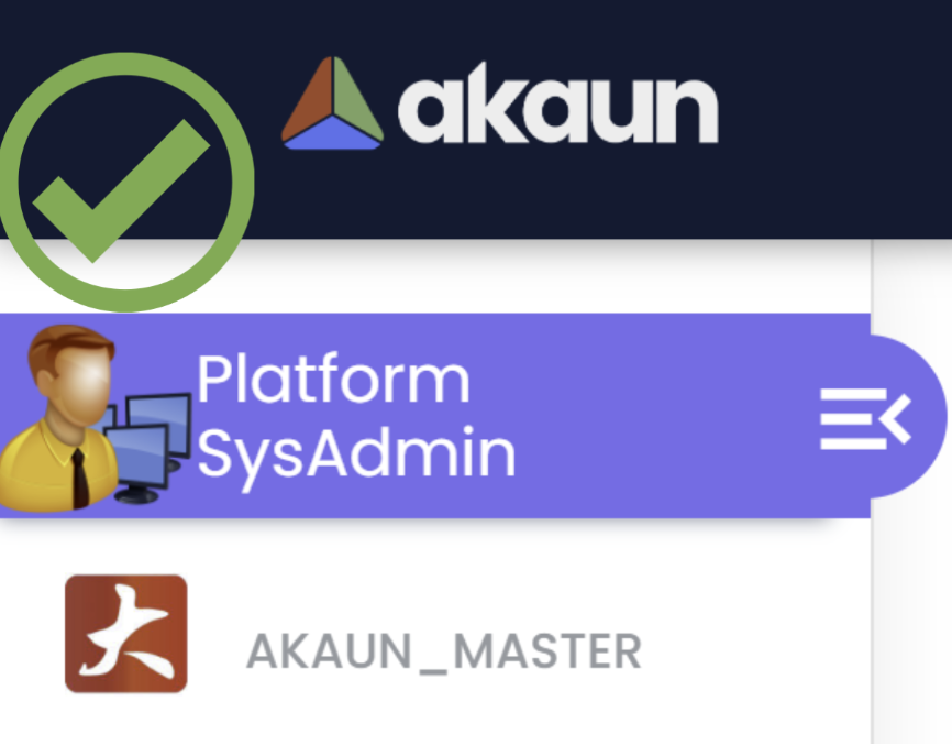
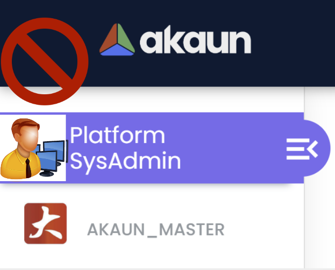
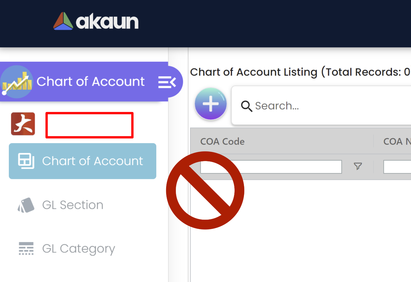
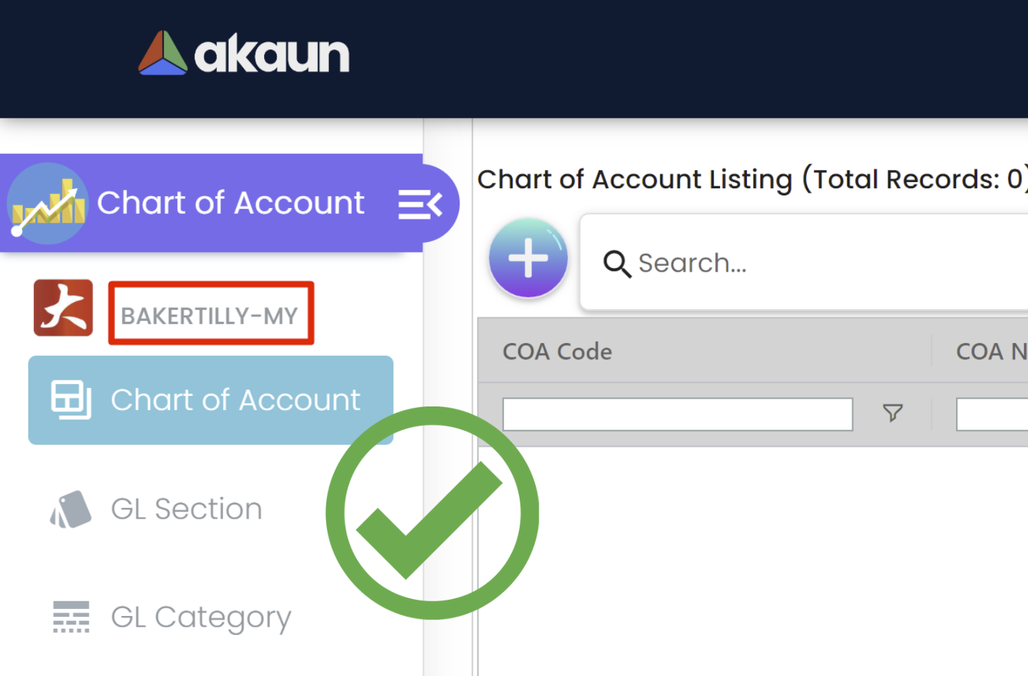
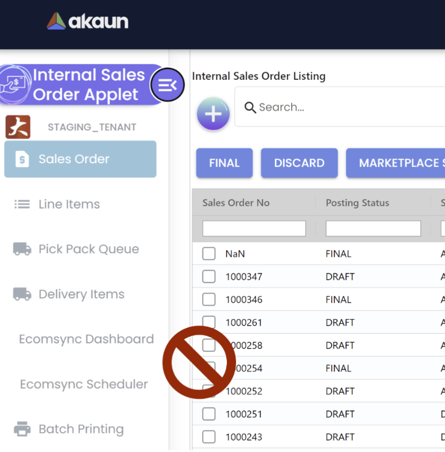
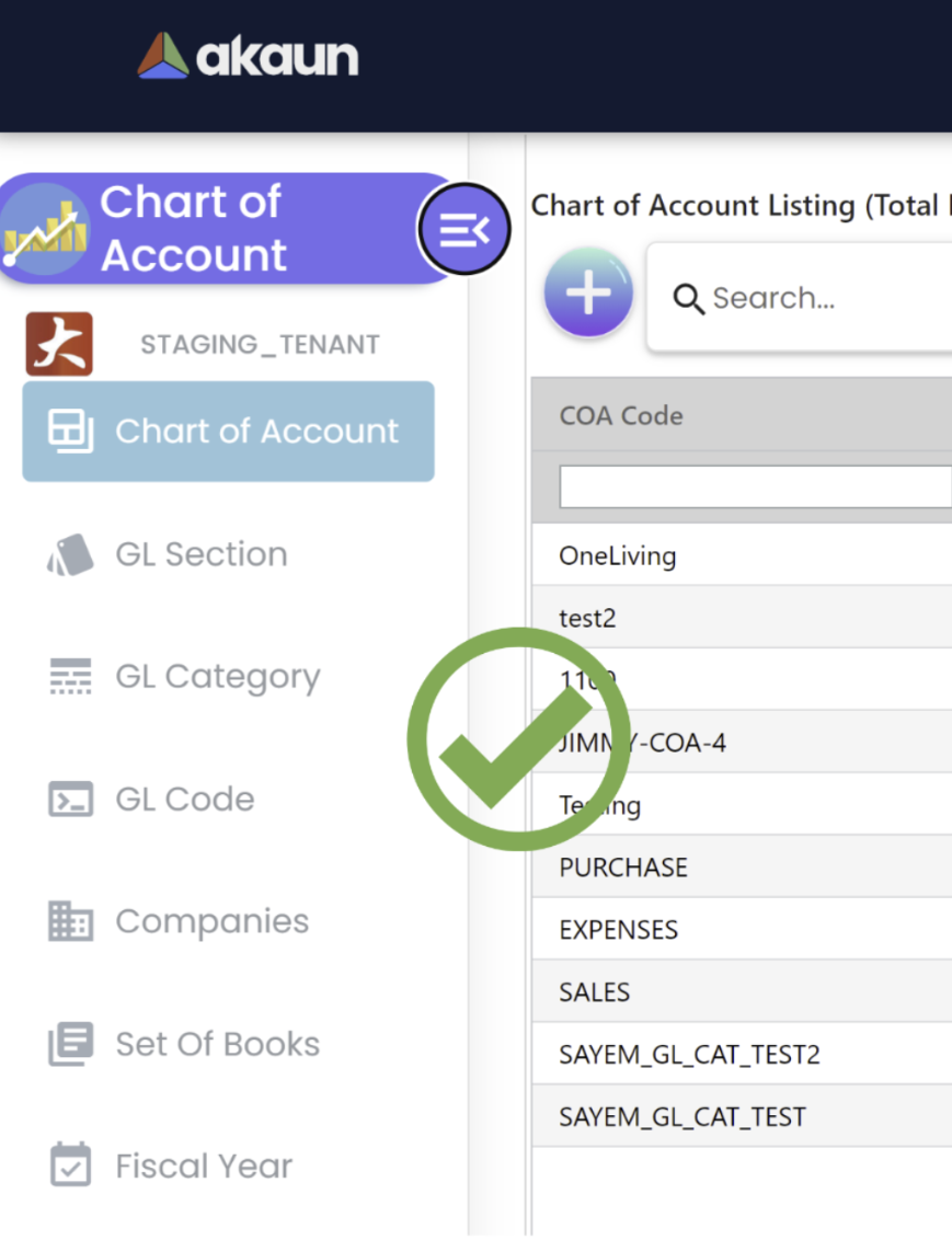
iii) Tenant name displaying below applet logo and name in the sidebar menu: Displaying the tenant name when opening an applet can help to improve user understanding, avoid mistakes, reinforce branding, and improve security. It can be particularly important in multi-tenant environments, but can also be useful in single-tenant applications where users need to switch between different contexts.
a) Applet without a Tenant Name❌
b) Applet with a Tenant Name✅
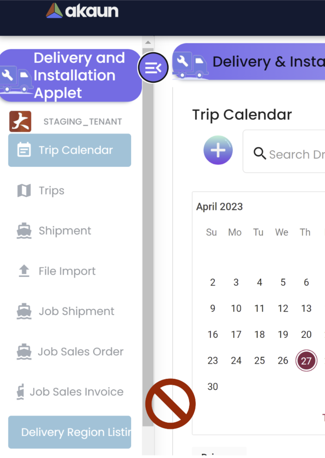
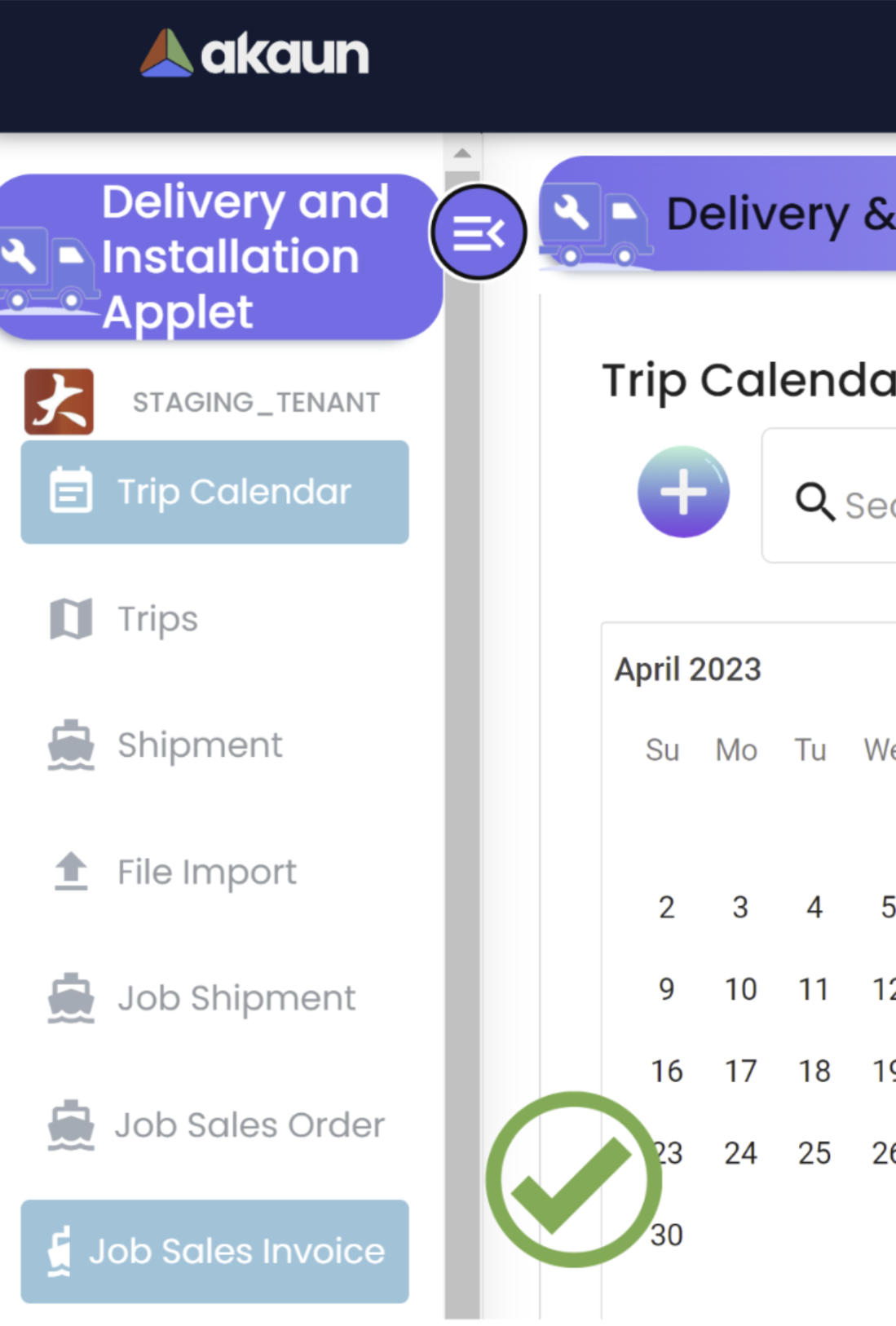
iv) Menu name to fit the sidebar width: This is important to create a consistent, accessible, and aesthetically pleasing user experience. By providing users with clear and concise menu names, it is easier for them to navigate the application and find the features they need.
a) Menu name not fitting the sidebar width❌
b) Menu name fitting the sidebar width ✅
v) Sidebar menu icons design - request the product/marketing team: Sidebar menu icons can help to establish a visual hierarchy, save space, enhance recognition, and improve aesthetics. By using icons in conjunction with text labels, users can more easily navigate the sidebar menu and find the options they need.
a) Without Sidebar menu icon❌
b) With Sidebar menu icon✅
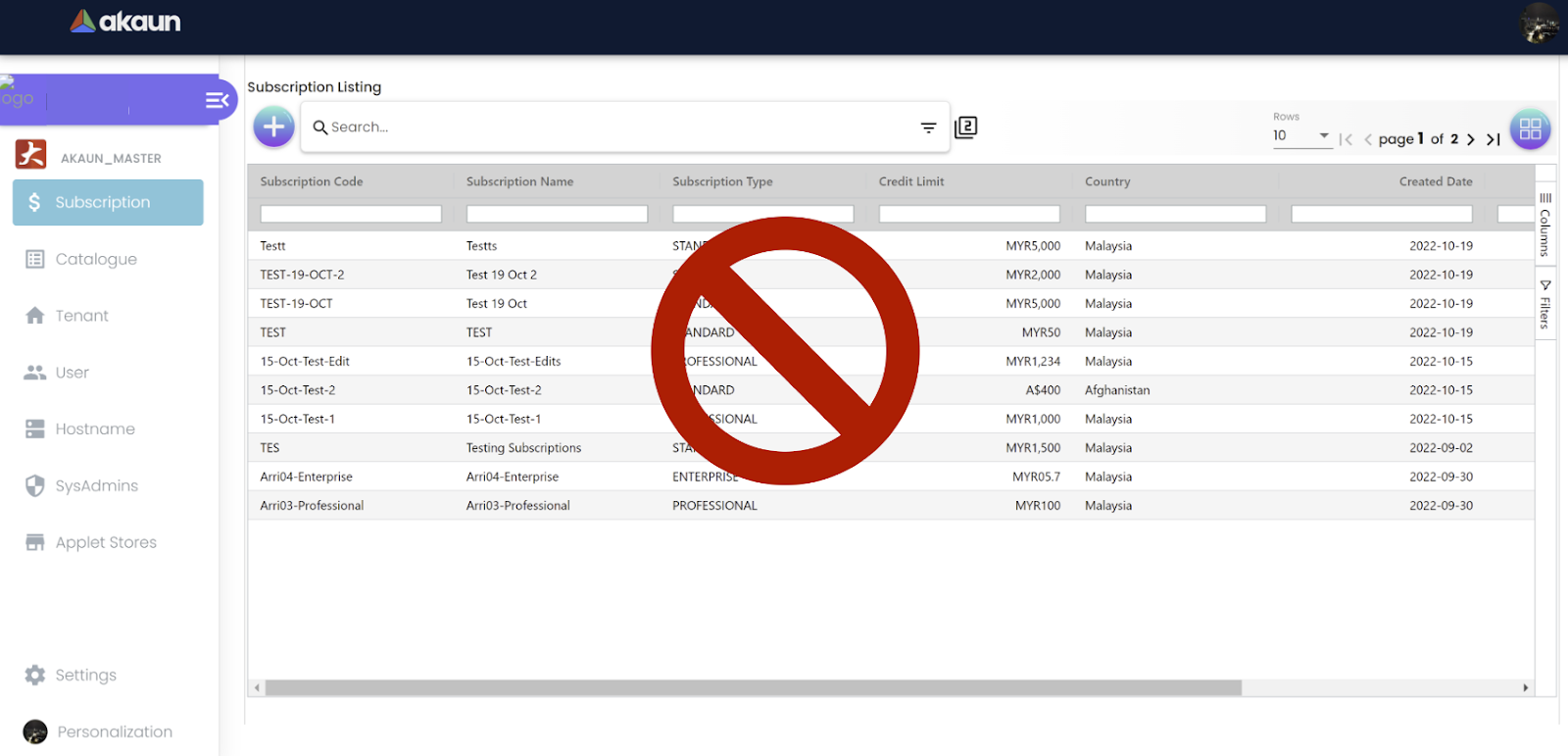
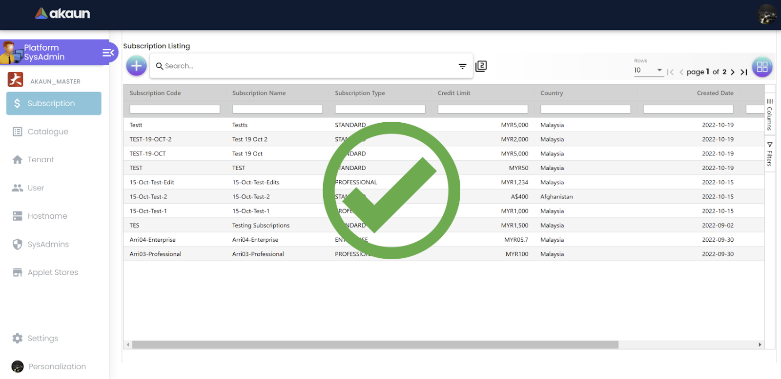
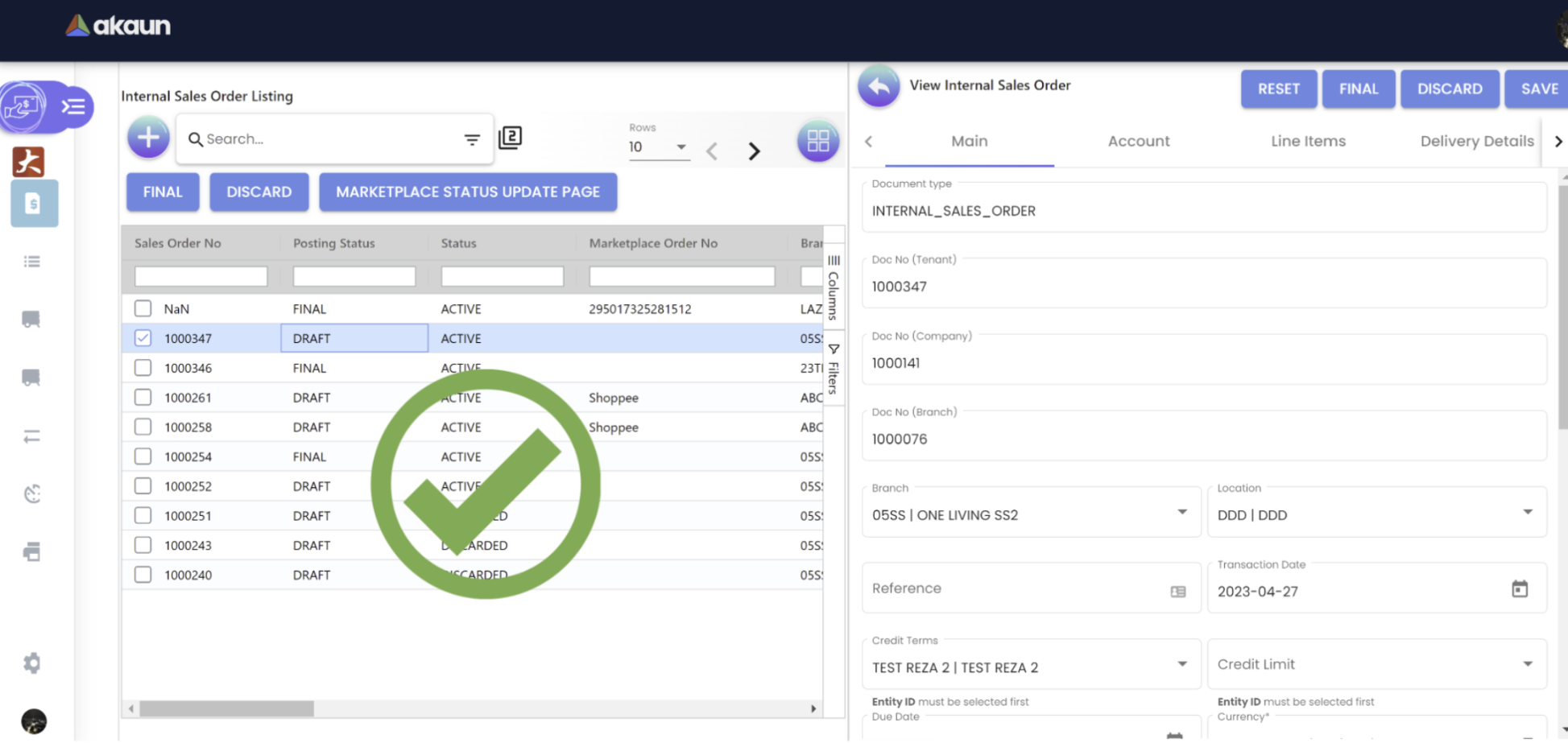
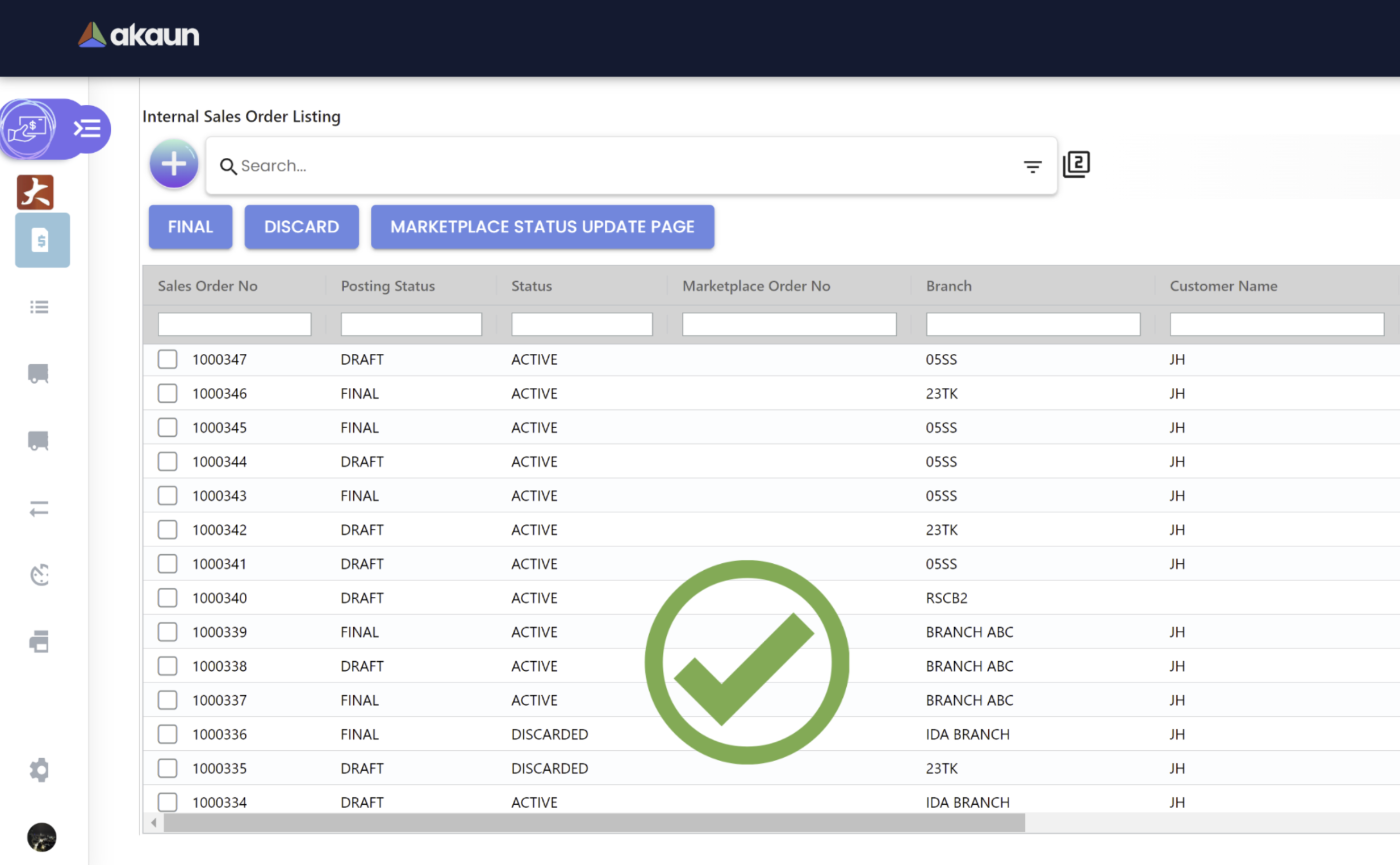
Show blue background color for the selected row: Tthe blue background color should “stay” while the users are clicking on the right-hand side column to edit/view an object. Showing a color background for the selected row in a listing can provide several benefits to users, including visual feedback, navigation, accessibility, and aesthetics. By carefully considering these benefits, developers can create more effective and user-friendly software interfaces.
a) Without color background for a selected row❌
b) With color background for a selected row✅
vi) UI to be drawer: UI drawers are typically used to provide a navigation menu or a list of options that can be hidden away when not in use. This can help to free up space on the screen and make the interface less cluttered. Drawers can be particularly useful in mobile applications where screen real estate is limited, but they can also be used in desktop applications.
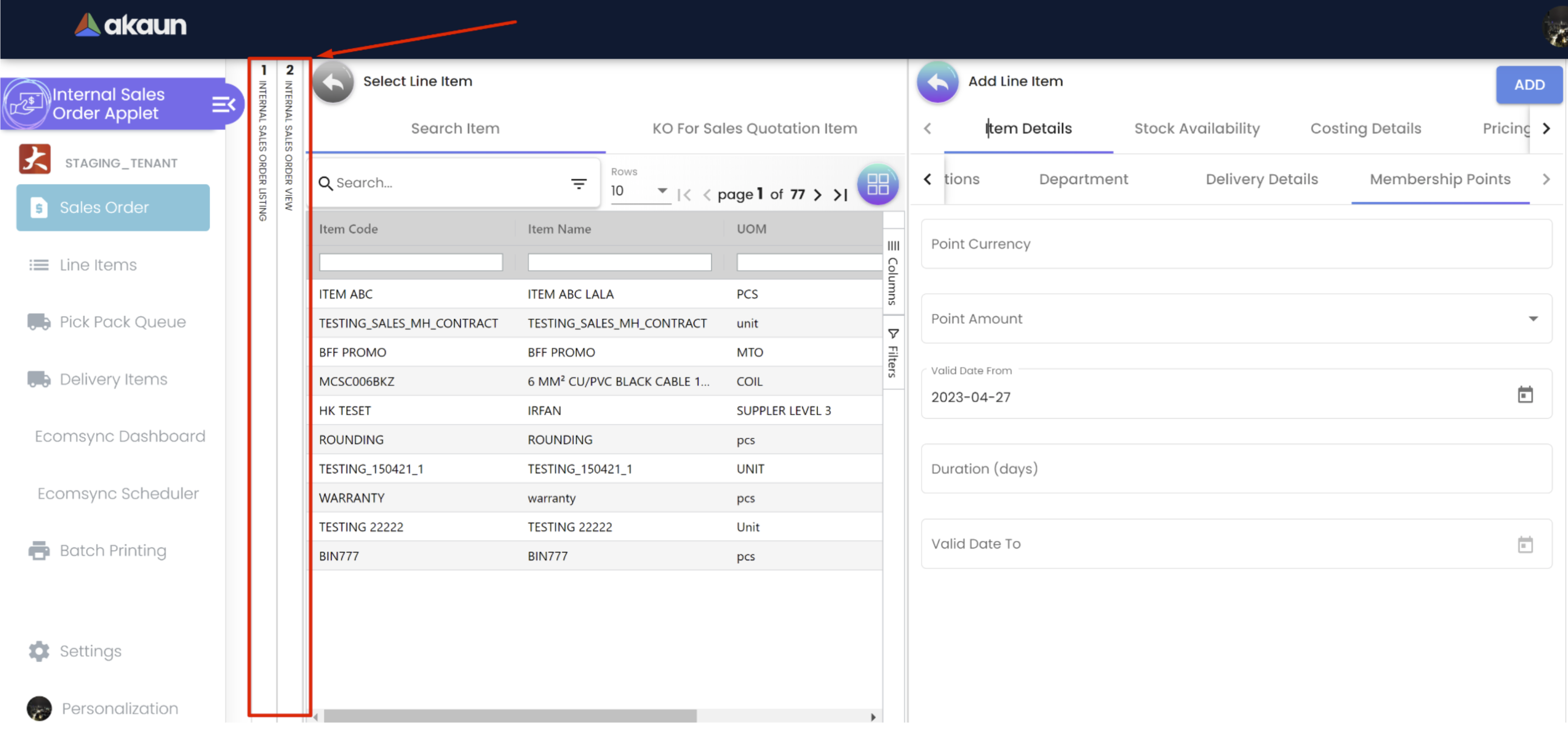
UI drawers can help to improve the user experience by providing a clean and organized interface, while NgRx can help to simplify the management of application state. However, whether or not you use these tools will depend on the specific requirements of your application.
vii) Dropdown and List Usability: Dropdowns and lists both have their own strengths and weaknesses, and the choice of which one to use will depend on the specific use case and user requirements. Here are some general guidelines:
a) Use a dropdown when:
-
Limited options: Dropdowns are ideal for presenting a small number of options to the user, typically less than 10. If there are too many options, it can make the dropdown too large and difficult to use.
-
Single selection: Dropdowns are typically used when the user needs to select a single option from a list of choices. If the user needs to select multiple options, a list may be more appropriate.
-
Conserve space: Dropdowns are compact and take up less space than lists, which can be important in applications where screen real estate is limited.
b) Use a list when:
-
Longer list of options: Lists are ideal for presenting a larger number of options to the user, typically more than 10. If there are too few options, it can make the list look sparse and incomplete.
-
Multi-selection: Lists are typically used when the user needs to select multiple options from a list of choices. If the user needs to select only one option, a dropdown may be more appropriate.
-
Scrolling is acceptable: Lists can take up more space than dropdowns, but they offer the advantage of displaying more options at once. If scrolling is acceptable, a list may be more appropriate.
Overall, the choice of using a dropdown or a list will depend on factors such as the number of options, the selection mode, and the available screen space. By carefully considering these factors, developers can choose the best option to meet the user’s needs.
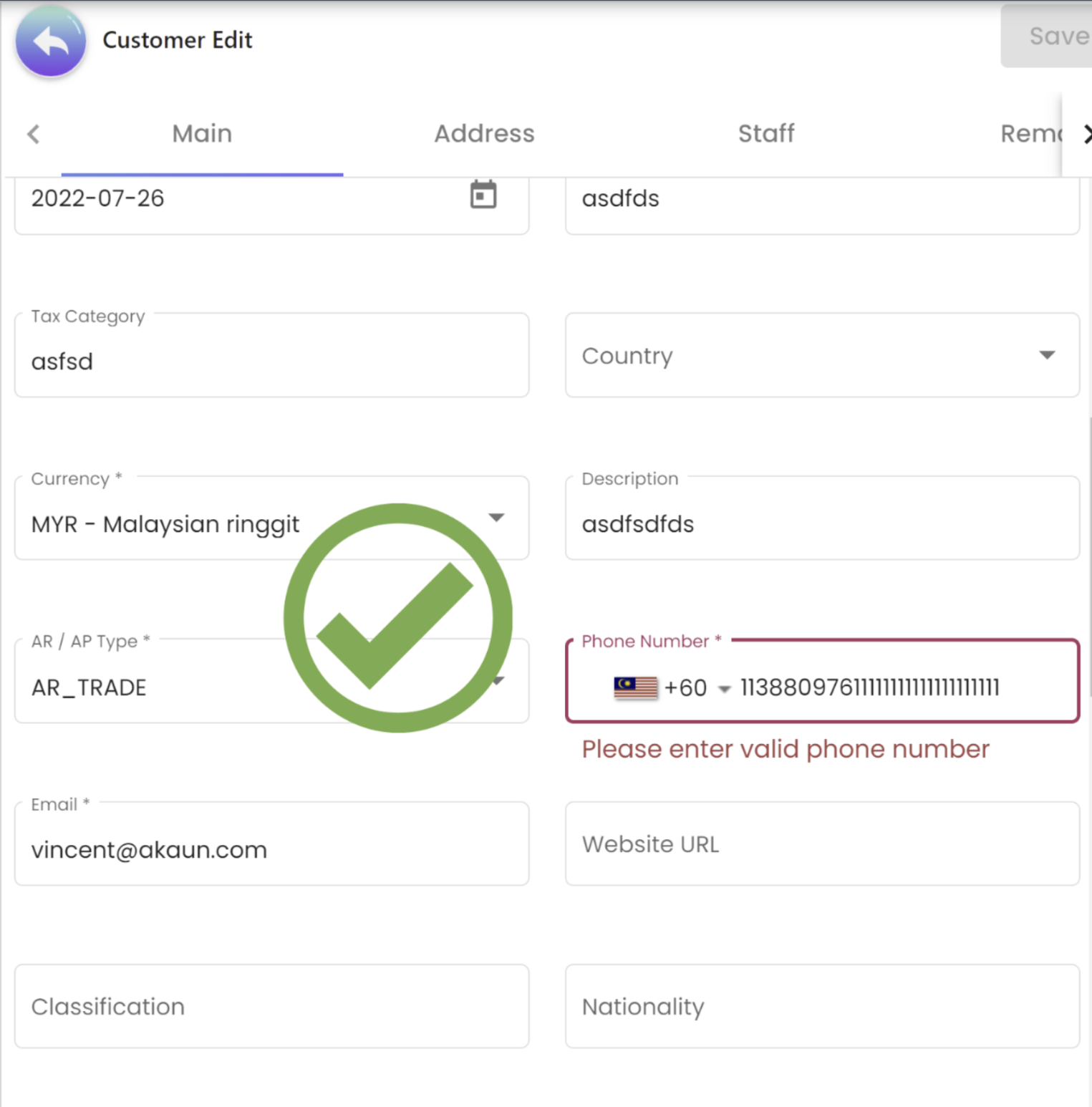
viii) Accurate field validation rules: Accurate field validations are essential for ensuring data quality, improving the user experience, enhancing security, maintaining compliance, and increasing efficiency.
a) Without accurate field validation❌
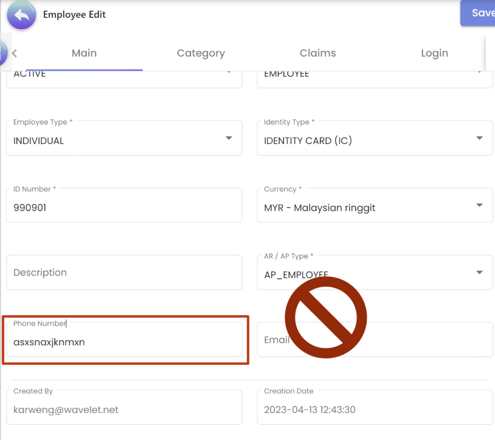
b) With accurate field validation✅
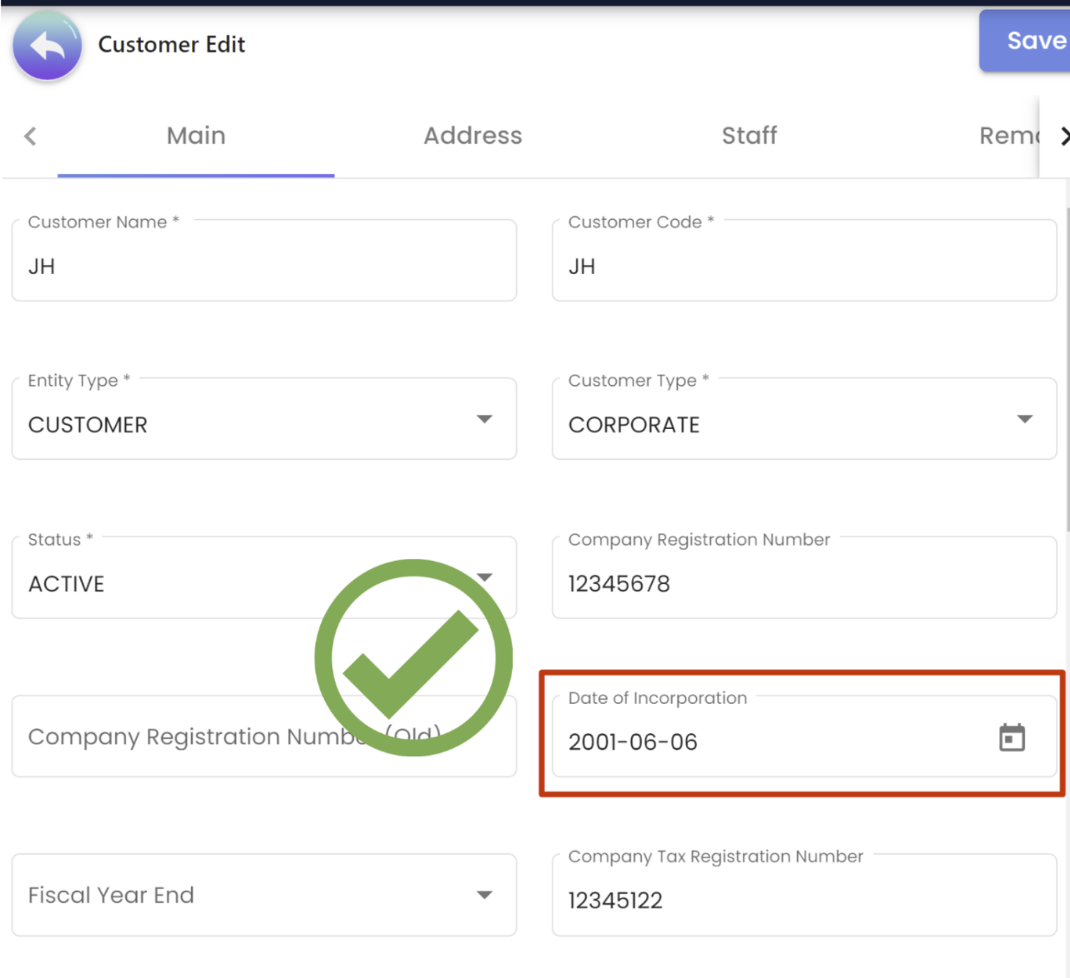
ix) Date format to be always YYYY-MM-DD: A standard date format, such as YYYY-MM-DD, is important because it ensures universal understanding, facilitates sorting and searching, is compatible with computer systems, and eliminates confusion and errors that can arise from using different date formats.
-
Universal understanding: The format YYYY-MM-DD is widely recognized and understood across different countries and cultures. This means that people from different parts of the world can understand the date easily and accurately without confusion or ambiguity.
-
Sorting and searching: Using a standard format for dates allows for easy sorting and searching of data in databases and computer systems. This makes it easier to find specific dates or to organize data chronologically.
-
Compatibility with computer systems: Many computer systems and software programs use the YYYY-MM-DD format as a default for dates. This means that if you use this format, your dates will be compatible with a wide range of systems and software.
-
Accuracy and clarity: The YYYY-MM-DD format eliminates any confusion that can arise from using different date formats. For example, in some countries, the day is written before the month, while in others, it is written after. By using the standard format, there is no room for misunderstanding or error.
x) Left align all texts or description in the AG Grid: Left-aligning text and descriptions in a document or design layout is common practice because it creates a clear organied visual hierarchy look that’s easy to scan, ensures consistency, and enhances accessibility. Here are a few reasons why left-alignment is commonly used:
-
Ease of scanning: Left-aligned text creates a clear visual hierarchy that makes it easy for readers to scan and quickly locate information. Our eyes naturally gravitate towards the left-hand margin, so aligning the text to this margin helps to guide the reader’s eye down the page.
-
Consistency: Left-alignment is a standard practice in many design and publishing applications, which makes it a familiar and expected format for readers. Consistently aligning text to the left margin helps to create a cohesive and professional look.
-
Accessibility: Left-aligned text is generally more accessible than other alignment options for readers with certain disabilities or visual impairments. This is because the text is aligned with a consistent starting point, making it easier for screen readers or other assistive technology to read the content accurately.
xi) Right Align all prices and costs with two decimal places in the AG Grid: Right-aligning prices and costs with two decimal places creates a consistent and professional appearance, enhances comparability and accuracy, and improves the readability of data. Here are some reasons why:
-
Visual consistency: Right-aligning the prices and costs creates a clear visual separation from the text in other columns, making it easier to read and understand the data. It also creates a neat and consistent appearance that enhances the overall design.
-
Comparability: By formatting all prices and costs with two decimal places, readers can easily compare and analyze the data across different rows and columns. This ensures accuracy and helps to avoid errors in calculations.
-
Familiarity: Formatting prices and costs with two decimal places is a common practice in many industries and is a familiar format for most readers. This makes the data more accessible and easier to understand.
Middle align all the numbers, integers, and dates in the AG Grid: Middle-aligning numbers, integers, and dates in a table or document helps to create a visually pleasing and organized layout, making it easier for readers to scan and compare the data. Here are some reasons why:
-
Visual consistency: Middle-aligning numbers and dates creates a clear and consistent visual separation between columns, making it easier to read and understand the data. It also enhances the overall design and creates a professional appearance.
-
Improved readability: Middle-aligning numbers and dates makes it easier for readers to scan the data and locate specific information quickly. This is especially important for tables or documents with a large amount of data.
-
Accessibility: Middle-aligning numbers and dates is more accessible than left-aligning them for some readers with certain disabilities or visual impairments. This is because the numbers are centered on the page, making it easier to read and comprehend.
2. Navigation:
This ensures that the software’s navigation is intuitive and easy to use. This can be done by testing the navigation menus, buttons, and other controls to ensure that they are easily discoverable and that they work as expected.
i) Applet landing page
a) Not to show an empty/blank page ❌

b) Auto-route to the first menu on the left ✅
ii) Error Messages
This ensures that the software’s error messages are clear and helpful. This can be done by testing the software’s error messages to ensure that they provide useful information and that they do not confuse users.
iii) Help and documentation
This ensures that the software’s help and documentation is easily accessible and useful. This can be done by testing the software’s help files, user manuals, and other documentation to ensure that they are complete, accurate, and easy to understand.
iv) User feedback This ensures that the software’s user feedback is taken into account. This can be done by testing the software with representative users and gathering their feedback to ensure that the software meets their needs and expectations.
v) Accessibility This ensures that the software’s is accessible to users with different abilities. This can be done by testing the software with keyboard-only navigation, screen readers, and other accessibility tools to ensure that it is accessible to users with different abilities.
vi) Internationalization This ensures that the software’s is adaptable to different languages, cultures and regions. This can be done by testing the software with different languages and cultures to ensure that it is adaptable to different languages, cultures, and regions.
vii) Compatibility This ensures that the software’s is compatible with different devices, platforms, and browsers. This can be done by testing the software on different devices, platforms, and browsers to ensure that it is compatible with different devices, platforms, and browsers.